
WHEN DID WE STOP BUYING THINGS WE LOVE?
An Autumn Reflection on Fashion, Value and Finding Your Own Style THE ARCHIVE JOURNAL | A FOUNDER’S PERSPECTIVESunday, 25 October
An Autumn Reflection on Fashion, Value and Finding Your Own Style THE ARCHIVE JOURNAL | A FOUNDER’S PERSPECTIVESunday, 25 October
ÉLAN ARCHIVE | SUNDAY 18 OCTOBER 2026 As billions disappear from the valuations of the world’s biggest luxury companies, something
Why the greatest handbags are recognisable without a logo, and what their silhouettes tell us about fashion, craftsmanship and the
More luxury guides coming soon!
There is something I want you to try the next time you pick up a handbag.
Instead of looking at the logo, ask yourself one very simple question:
Why is that there?
Why does that piece of leather fold over the front? Why is there a padlock hanging from the bag? Why are the handles attached there rather than somewhere else? Why does that bag have a gusset? Why that clasp? Why that chain? Why that particular shape?
Because one of the things I find most fascinating about great handbag design is that some of the details we now immediately associate with luxury were never created simply to look luxurious. They had a job.
And sometimes, through repetition, craftsmanship and extraordinarily good design, those practical details became so recognisable that they stopped being merely functional and became part of the visual language of an entire fashion house.
That, for me, is when handbag design gets really interesting.
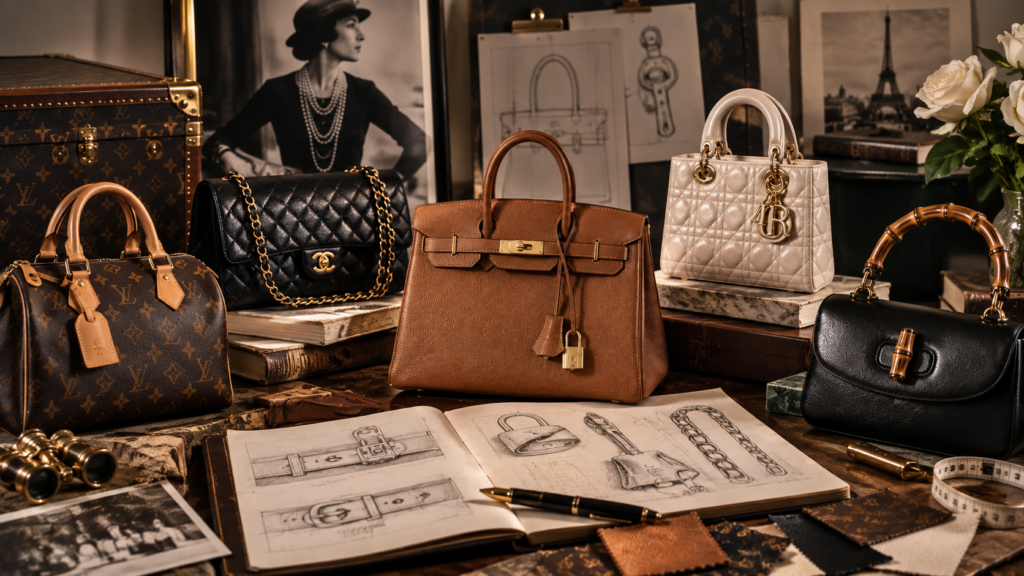
We spend an enormous amount of time in luxury talking about signatures. The Chanel chain. The Hermès clochette. Dior Cannage. Louis Vuitton luggage details. Gucci bamboo.
Today they are powerful visual codes.
But go backwards through their histories and you often discover something much more practical sitting underneath them. Sometimes there was a problem that needed solving. Sometimes there was a material limitation. Sometimes the designer simply wanted the person carrying the bag to be able to use it more easily.
And eventually we forgot about the problem and simply fell in love with the solution.
Perhaps the perfect place to start is Chanel.
Today, putting a handbag over your shoulder is so ordinary that it is difficult to imagine it ever feeling radical. Gabrielle Chanel understood something incredibly important, a handbag had to work with the woman carrying it.
When Chanel created the 2.55 in February 1955, one of its defining characteristics was its chain shoulder strap. Chanel itself describes the bag as functional because that sliding chain allowed the wearer’s hands to remain free. Think about that for a moment.
Something we now instantly identify as one of Chanel’s great aesthetic signatures began with practicality. The chain isn’t merely jewellery attached to a handbag, it changes how the handbag is carried and that distinction matters. And over time, Chanel turned that practical solution into one of the strongest visual codes in fashion.
You can see a chain running across somebody’s shoulder from across a room, catch a glimpse of quilting underneath it, and your brain starts saying Chanel before you have seen a single logo.
That is design language at its most powerful.
It also explains why I find genuinely successful handbag design so much more interesting than simply adding recognisable branding to an otherwise ordinary object.
The design itself should be doing some of the talking.
If there is one house where this conversation becomes almost irresistible, it is Hermès.
Pick up a Kelly and you are looking at a collection of details that have become extraordinarily decorative precisely because they are so functional, the straps, The turn-lock, even the clochette, lock and key.
Hermès traces the Kelly’s origins to Robert Dumas’s 1930s trapezoidal “small women’s bag with straps,” highlighting the functional elements that would become signatures of the design. The house describes the clochette quite literally as the leather casing that houses the key.
Today, of course, that clochette has become something else entirely, it is part of the look. Remove it and many collectors immediately feel something is missing.
And I know this personally because when I recently ordered a replacement clochette for Miranda, my Birkin 40, I wasn’t simply replacing a leather accessory hanging from a bag, visually, it completes her.
That is extraordinary when you think about it. A tiny leather cover designed to protect a key has become such an important aesthetic code that Hermès now reinterprets the form in jewellery.
Function has literally become ornament.
And the same can be said for those famous sangles running across the front. Yes, they create the Hermès face we all recognise, but they also close and secure the bag. That is what I love about the very best Hermès design, the decoration often isn’t sitting on top of the construction.
The construction is the decoration.
Louis Vuitton gives us perhaps the clearest example of function becoming fashion because the house’s design language is rooted so heavily in travel.
The modern customer might carry a Speedy to lunch, a Keepall through an airport or a Noé through London without ever thinking particularly deeply about why those bags are constructed as they are. But look backwards and their design suddenly makes sense.
Louis Vuitton says the Speedy began in the 1930s as the “Express” carry-on bag, created to reflect an age fascinated by increasingly rapid travel. The Keepall was built around a flexible horizontal structure and strong Toron handles.
But my favourite example is the Noé. Because the origin story is wonderfully unglamorous.
It was designed after a champagne house asked Gaston-Louis Vuitton for a bag strong enough to carry five bottles of champagne and suddenly that familiar bucket shape makes complete sense.
The wide body, the drawstring top, the substantial base. Those details weren’t selected because somebody thought a bucket bag might look fabulous on Instagram ninety years later, they solved a problem.
And yet the resulting proportions proved so good that the practical object crossed over into fashion. We now look at the Noé and see Louis Vuitton and the bottles have almost become irrelevant.
The design survived because the solution was beautiful.
Sometimes, great design doesn’t come from having unlimited possibilities, it comes from restrictions.
The Gucci Bamboo is a perfect example.
In post-war Italy, traditional raw materials were difficult to obtain. Gucci turned to bamboo, lightweight, durable and available — and Florentine artisans developed the technically demanding process of heating and bending the material over a flame to create a curved handbag handle. Gucci dates the original Bamboo bag to 1947.
Necessity created experimentation, experimentation created craftsmanship and craftsmanship created an icon.
That is an important lesson because luxury today can occasionally become obsessed with the idea that expensive materials automatically create great design, they don’t.
A designer confronted with a limitation can sometimes produce something far more interesting. The bamboo handle works because it isn’t merely a Gucci logo translated into another form, it has texture, shape, construction and variation.
Every piece behaves slightly differently because the material itself is natural and now, decades later, Gucci doesn’t need to explain the reference.
Show a curved bamboo handle attached to leather and most people interested in handbags immediately understand the language, Again, no enormous logo required.
Dior gives us a slightly different version of this story.
The famous Cannage pattern wasn’t originally created as a handbag motif at all.
At Christian Dior’s early presentations at 30 Avenue Montaigne, guests sat on Napoleon III-style chairs with woven cane seats. Dior explains that this pattern later became one of the house’s enduring visual codes and ultimately part of the identity of pieces including the Lady Dior.
And I love this example because it demonstrates that design language doesn’t necessarily begin at a drawing board with somebody announcing, “Right, let’s invent an icon.”
Sometimes the ingredients are simply sitting there, a chair, a room, a texture or a detail. Then somebody notices that the pattern says something about the house. Eventually Cannage moves from the environment surrounding Dior clothes onto the objects themselves.
And once again we arrive at that lovely point where most consumers no longer need an explanation. You only need to see Cannage stitched beautifully into leather and Dior enters your head.
That is the power of repetition when the original code is strong enough.
And this brings me to something broader.
We tend to talk about handbag design through the obvious things the colour, leather, logo or the size. But sometimes the most important parts of a design are the ones we barely notice anymore.
The gusset allowing the body to expand, a reinforced base preventing collapse, feet protecting leather from the surface underneath.
The list goes on and on, a flap giving security.
A drawstring adjusting capacity.
A wider handle distributing weight differently.
A longer shoulder strap freeing the hands.
A structured frame protecting the contents.
A lock doing exactly what the word suggests.
Good design can make these things appear inevitable, you look at the finished bag and think, of course it looks like that.
But somebody had to decide, and those decisions are why two bags made from similarly beautiful leather can feel completely different in your hands.
There is another fascinating stage in this evolution.
Eventually the functional detail becomes so closely associated with a house that the brand starts preserving it even when modern life no longer demands it in quite the same way.
Nobody is buying a modern Noé primarily because they need to transport five bottles of champagne, most Kelly owners probably aren’t locking and unlocking their handbag every time they reach for their phone and very few of us require luggage features because we are boarding a steamship with trunks behind us.
But remove those details and we feel their absence, why?
Because function became memory, and memory became identity.
The detail is now carrying the history of the design as much as it is carrying out its original task and that is one of the reasons heritage matters in luxury.
Not because everything old must automatically be better, it isn’t. But when a design has been refined over decades, the little elements often contain stories that a newly created bag simply hasn’t had time to acquire.
I love new design. I love innovation. I love seeing a creative director come into an established house and challenge what we think that brand should look like.
But there is a difference between detail and purpose and sometimes I look at a modern bag and there is a lot happening. Extra buckles, extra straps, hardware, charms and fastenings.
And I find myself asking the same question I asked at the beginning:
Why is that there?
If the answer is simply “because it makes the bag look expensive,” I’m usually less interested, because some of the greatest handbags ever created work the opposite way around. They didn’t add function because it looked beautiful.
The function became beautiful because it belonged there.
That, to me, is far more sophisticated.
Understanding this stuff also changes the way you shop, and this is where my collector brain and my reseller brain meet.
Look beyond the logo, pick the bag up, open it, close it.
Look at the handles, look at the corners, look at where the bag naturally wants to crease.
Look at the hardware and ask what it actually does, look at how the interior relates to the exterior, look at whether the bag works when it is empty and whether the design still works when it is full.
And if you’re buying preloved or vintage, those functional points matter even more.
Closures wear.
Handles stretch.
Gussets soften.
Bases bow.
Hardware loosens.
Drawstrings crack.
Those areas can tell you an enormous amount about how the bag has lived. They can also tell you whether the original design was genuinely practical or whether it merely looked good when it left the boutique.
For me, that is another reason vintage and archival bags are so fascinating, you don’t simply get to see the designer’s idea.
You get to see what happened when real life tested it.
Perhaps this is ultimately why I am so fascinated by design language. The strongest houses have developed visual codes so powerful that you don’t always need to see their names.
The shape of the handle tells you, the fastening tells you, the stitching tells you, the way the leather folds tells you, even the way the bag opens tells you.
And sometimes the tiny detail you assumed was merely decorative turns out to be the reason the entire design exists.
So the next time you pick up a handbag, try something, forget the logo for a second. Look at the parts, ask what they do and ask why they are there.
Because the greatest design signatures often weren’t created with the intention of becoming signatures at all.
They became iconic because they worked — and somewhere along the way, we fell in love with the way they looked.
Keep the passion, enjoy the journey.
Tony | The Designer Bag Guy
Élan Archive