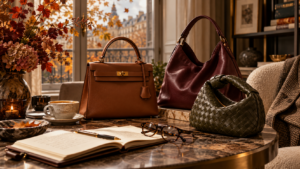
WHEN DID WE STOP BUYING THINGS WE LOVE?
An Autumn Reflection on Fashion, Value and Finding Your Own Style THE ARCHIVE JOURNAL | A FOUNDER’S PERSPECTIVESunday, 25 October

An Autumn Reflection on Fashion, Value and Finding Your Own Style THE ARCHIVE JOURNAL | A FOUNDER’S PERSPECTIVESunday, 25 October
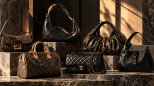
ÉLAN ARCHIVE | SUNDAY 18 OCTOBER 2026 As billions disappear from the valuations of the world’s biggest luxury companies, something
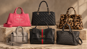
Why the greatest handbags are recognisable without a logo, and what their silhouettes tell us about fashion, craftsmanship and the
Spring doesn’t arrive loudly in luxury—it unfolds.
Not in trends, but in shifts. In nuance. In the way colour begins to soften, warm, and reassert itself after seasons of restraint.
For Spring 2026, the maisons aren’t chasing statement—they’re refining identity through colour. What we’re seeing is less about “what’s in” and more about what endures, reinterpreted through tone.

Neutrals remain the foundation—but this season, they’re warmer, more deliberate.
Think:
At houses like Hermès and The Row, these tones aren’t background—they are the statement.
The shift?
Cool, stark minimalism is giving way to something more tactile. More human.
What it means for the archive:
Neutrals continue to be the most liquid, but the edge now lies in temperature. Warmer palettes photograph better, wear softer, and resonate more broadly.

Pastels return—but not as you remember them.
At Chanel and Dior, they arrive muted, almost diffused:
There’s a restraint here—nothing saccharine, nothing overtly seasonal.
The difference:
These tones are styled with structure. A pastel flap, but with sharp tailoring. A soft hue, grounded in seriousness.
Archive insight:
Pastels remain less liquid than neutrals—but selective buying (full sets, pristine condition) can create standout moments in a curated drop.

If neutrals are the foundation, earth tones are the evolution.
Across Bottega Veneta and Loewe:
These are colours with weight. With texture.
They feel collected, not styled.
Why it matters:
Earth tones bridge the gap between safe and statement. They offer depth without risk.
For Élan:
This is where storytelling lives—pieces that feel grounded, timeless, and quietly powerful.

Then—punctuation.
A single, deliberate moment of colour:
Seen at Valentino and Gucci, these are not all-over looks—they are placed.
A neutral wardrobe, interrupted by one precise note.
The key shift:
Colour is no longer layered—it’s edited.
Archive perspective:
Statement colours still carry risk—but when executed correctly, they create desirability far beyond trend cycles.
Spring 2026 isn’t about reinvention—it’s about refinement.
For the archive, the direction is clear:
Buy with intention.
Curate with restraint.
Let colour do the work—quietly.
Because in a market that moves fast, the pieces that endure are rarely the loudest.
They’re the ones that feel considered.